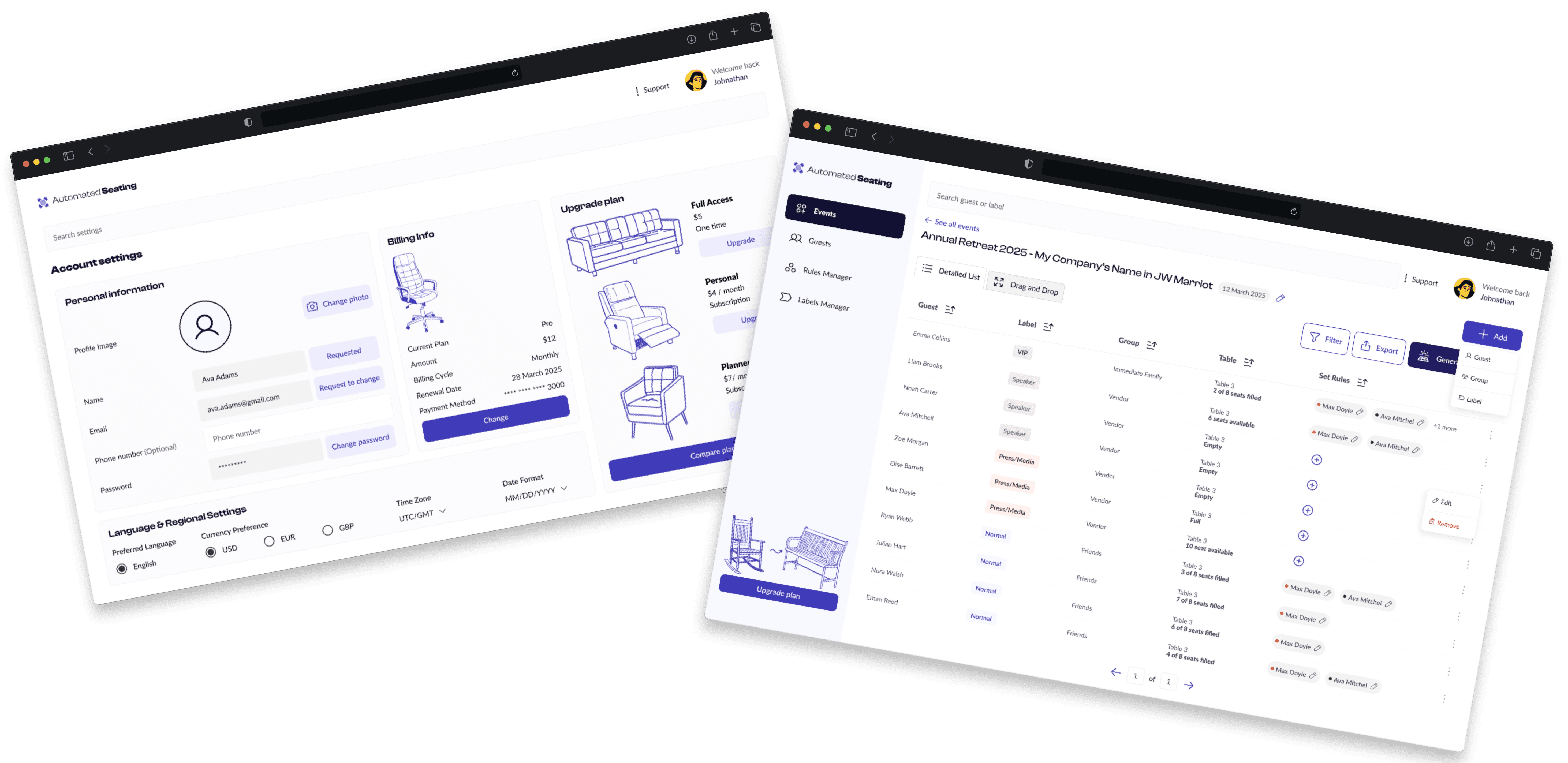
The goal was to redesign both the landing page and internal dashboard to create a clearer, more intuitive user experience. The landing page was updated to better showcase product benefits and drive conversions, while the dashboard was streamlined for usability, improved tool organization, and visual consistency through a refined design system.
Role
UX Designer
Employer
Automated
Seating
Platform
Web Responsive
Industry
Venue Management Software (SaaS)
Approach
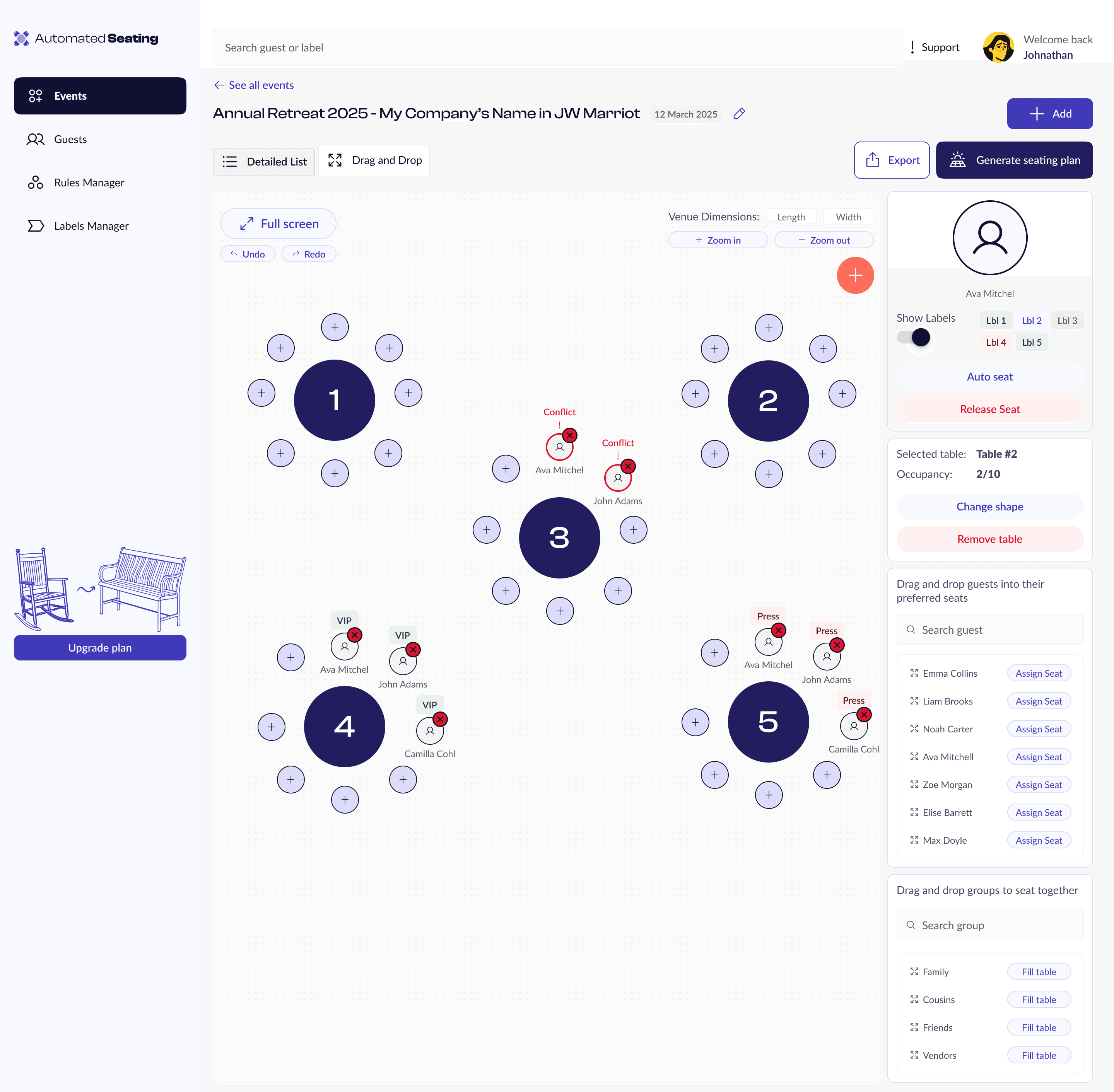
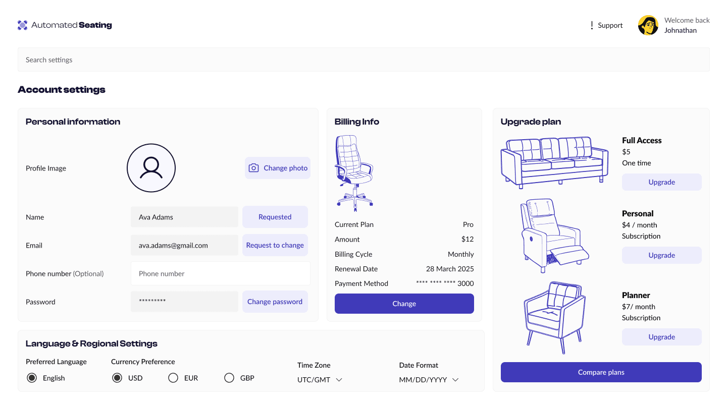
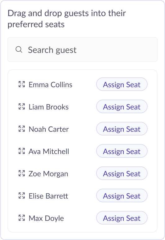
The client requested two dashboard views: a traditional detailed table view and a new, more interactive drag-and-drop interface.
The challenge was to prioritize which features were essential for each view, keeping the detailed functionality in the tabular layout while simplifying the drag-and-drop version for quick edits and high-level control.
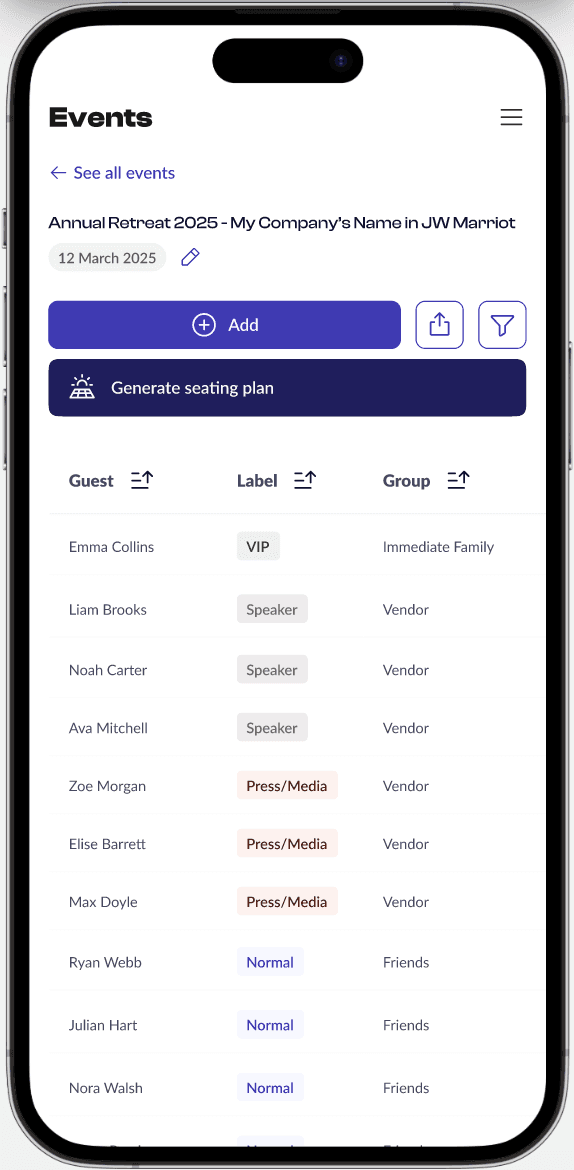
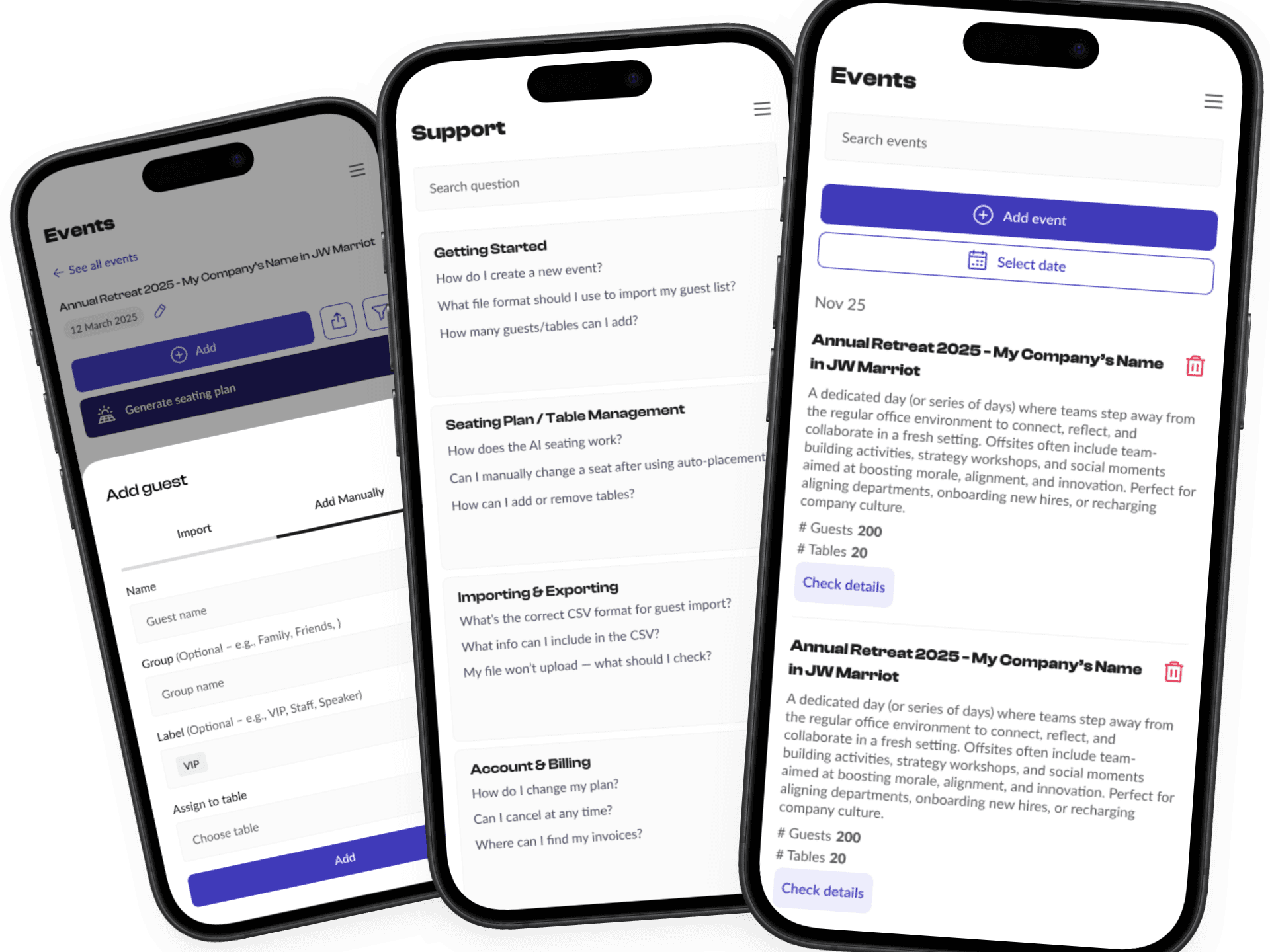
Another key consideration was mobile responsiveness; not all features could translate directly, so careful decisions were made to maintain usability on smaller screens without overwhelming the interface.


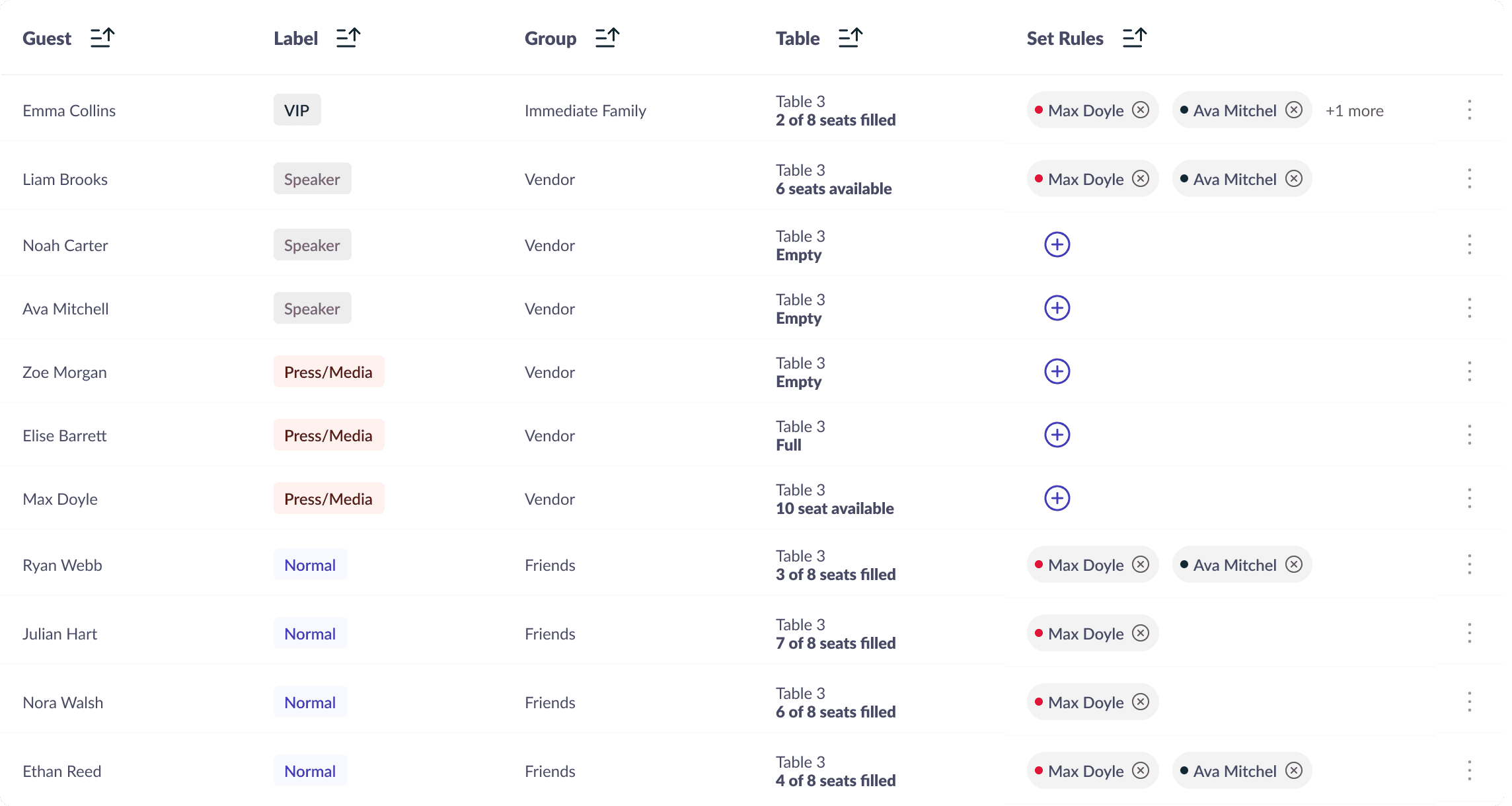
Better visual categorization for table contents

Background
The original landing page was plain and lacked visual appeal, making it difficult to engage visitors or reflect the brand’s potential.
The client wanted a design that felt both aesthetic and professional, something that would resonate with creative audiences like wedding planners, while still appealing to corporate clients.
The challenge was to strike the right balance in tone and presentation to speak to both markets effectively.
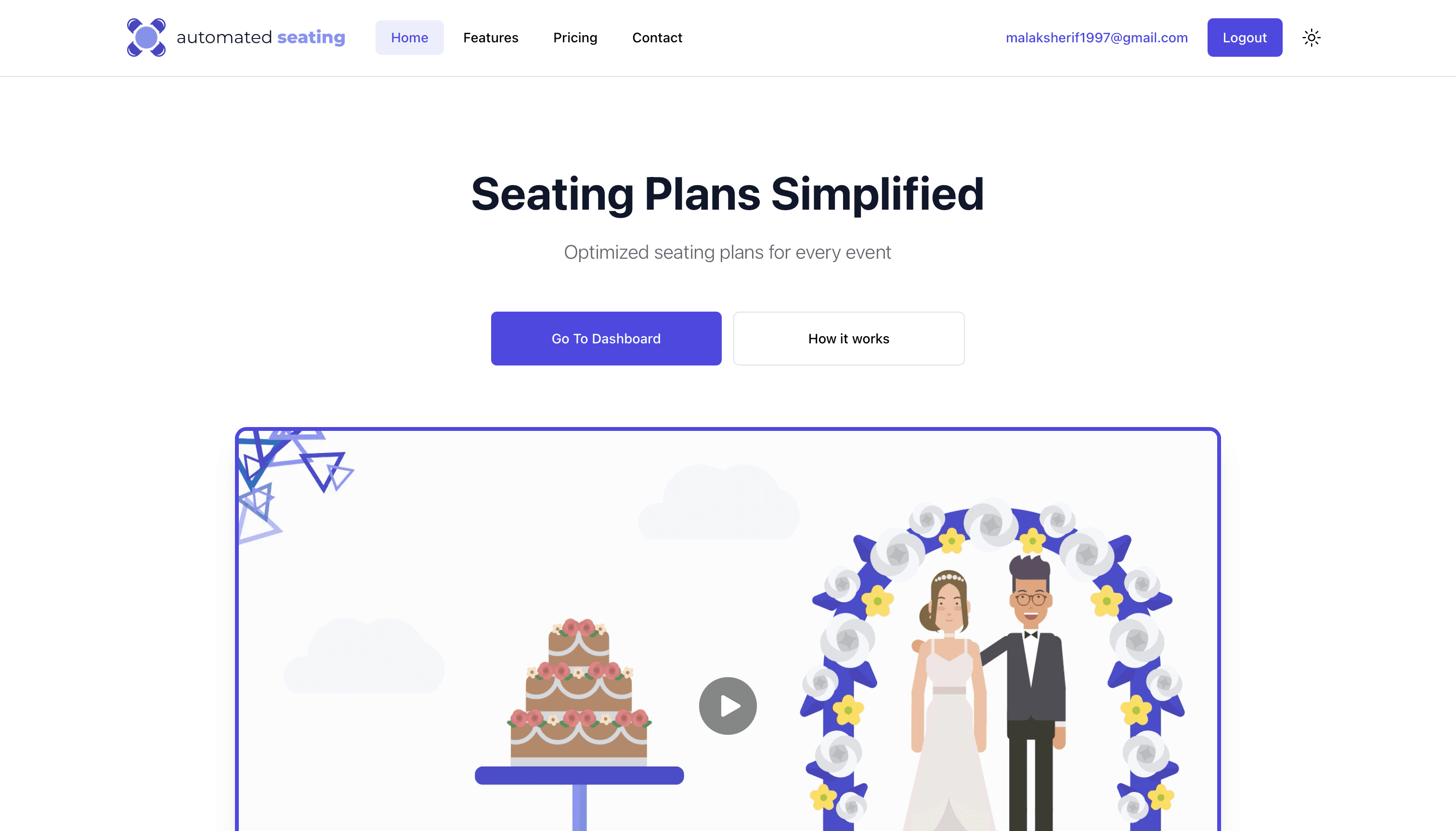
The original feed, highlighting some of it’s shortfalls.

Strike the right balance in tone, presentation to speak to the target audience effectively.

The original feed, highlighting some of it’s shortfalls.

Resonate with audiences like wedding planners, while still appealing to corporate clients


Delivering info in a clear, practical display
Design System
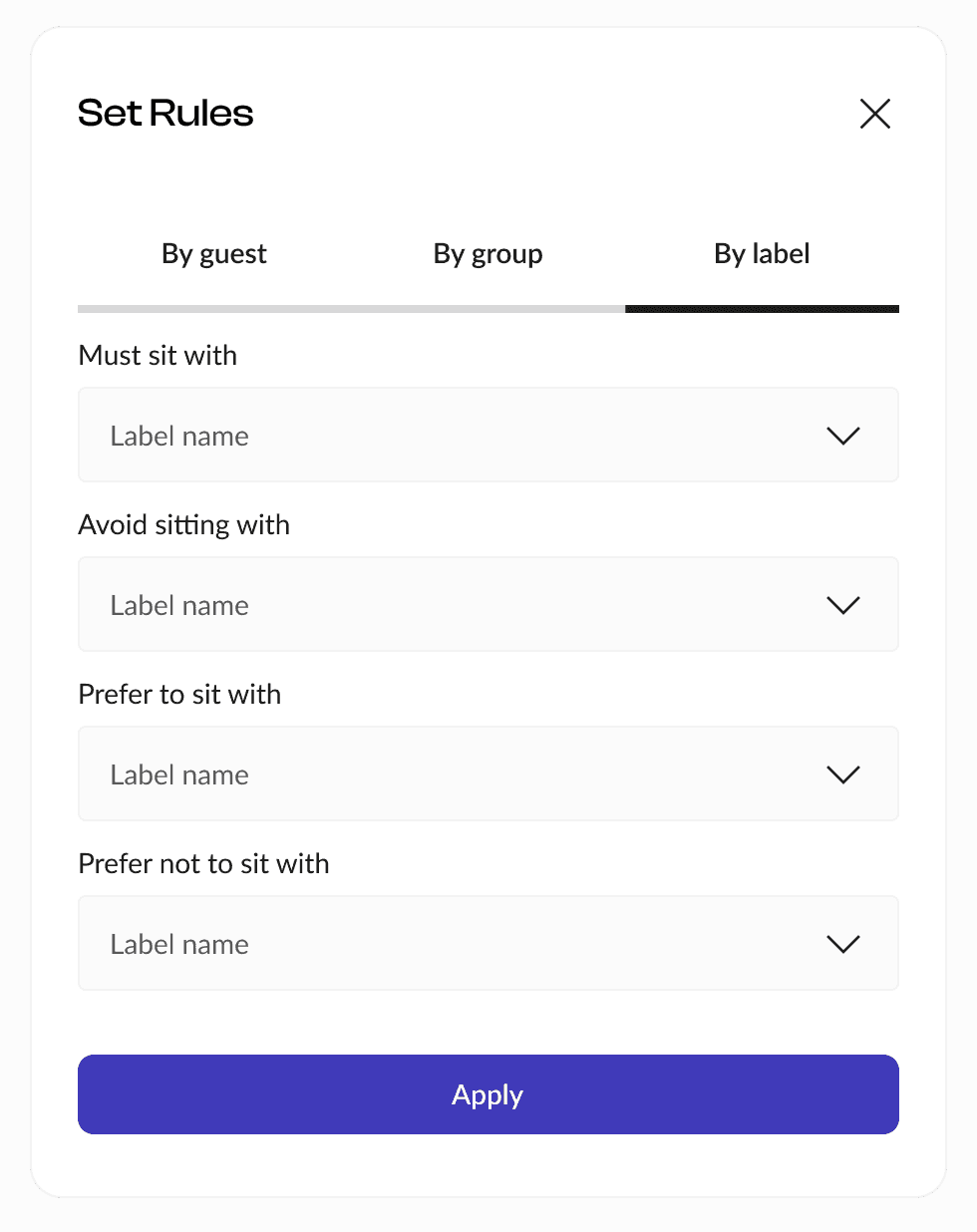
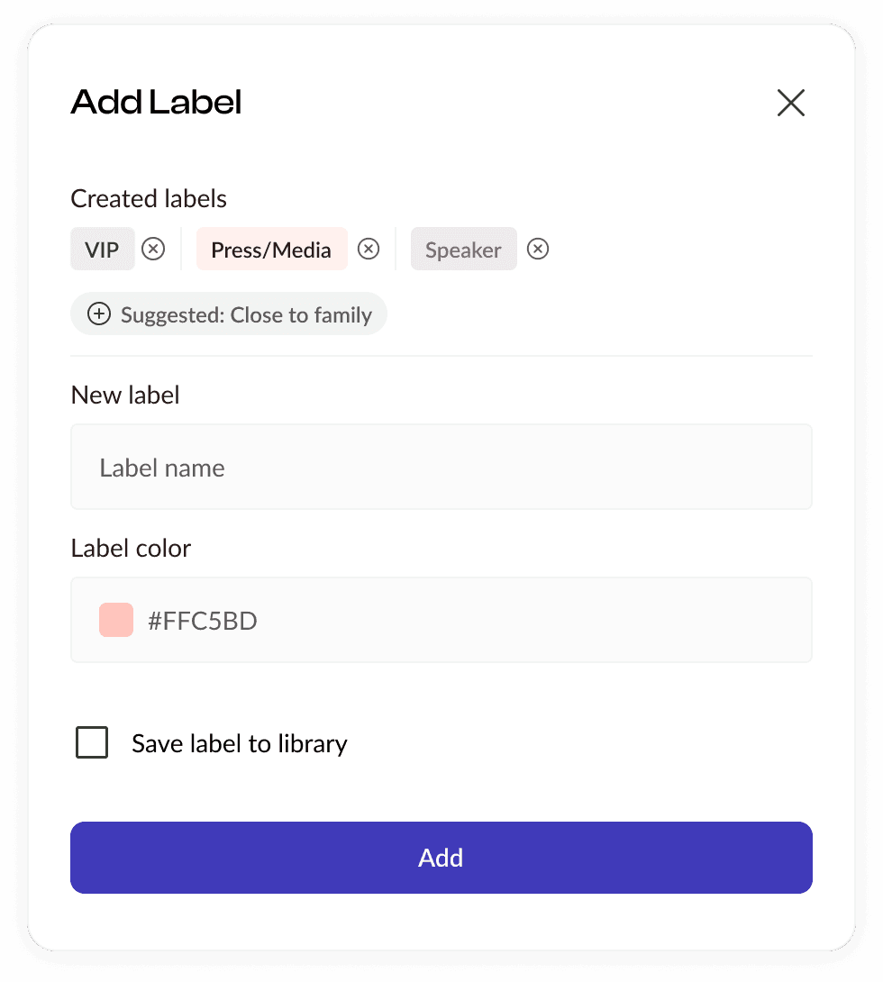
To support a more consistent and scalable user experience across the dashboard, I created a tailored design system focused on reusable components.
This included table structures, filter panels, modals, and status indicators, designed specifically for the needs of Automated Seating’s workflow.





Back to Top
