Payment Gateway
Redesigned an outdated mobile payment gateway flow by incorporating updated brand guidelines, aligning with modern UX/UI trends, and addressing user feedback to improve usability, security, and the overall transaction experience.
Role
UX Designer
Employer

Platform
Mobile
Industry
Financial Services


Background
The existing payment gateway flow had become outdated, both visually and functionally. As part of a broader product update, the goal was to modernize the mobile experience by aligning it with new brand guidelines and addressing critical usability pain points reported by users.
Part of the challenge was to elevate and clarify the user experience while maintaining structural familiarity, ensuring merchants and consumers could adapt easily without significant changes to their cognitive flow.
Problem Space
The checkout experience in traditional or outdated payment gateways is often high-friction, causing anxiety and leading to cart abandonment.
Users face challenges such as:
Scattered or unclear payment method selection
Intimidating forms with confusing input validation
Lack of real-time error handling and descriptive feedback
Anxiety around transaction security and data privacy
Rigid step-by-step processes that don't accommodate quick corrections
Poor visibility of order totals and breakdowns during the payment step
These pain points directly impact conversion rates and diminish user trust in the merchant's checkout ecosystem.
Product Goals
Reduce Checkout Friction

(Old-Left vs New-Right Designs)
Minimize cognitive load by simplifying input fields, clarifying layout hierarchy, and accelerating the path to transaction completion.
Build User Trust & Confidence

Introduce clear security indicators and professional design consistency to ease payment anxiety and reduce drop-offs.

Provide instant, non-intrusive, and highly descriptive validation to help users fix errors immediately without resetting fields.
Create a Scalable Component Architecture

(Old-Left vs New-Right Designs)
Design modular payment fields and layout systems that support future payment methods, regional compliance needs, and brand updates.
Research & Discovery
To modernize the payment flow while keeping the layout familiar and intuitive, the redesign strategy relied on:
Key Insights
Security Validation is Non-Negotiable
Users need constant reassurance. Small visual changes; like clear badge indicators, explicit button states, and trust icons, significantly increase user confidence.


Input Clarity Drives Conversions
Vague error messages or resetting forms upon a single mistake create immense frustration. Real-time field formatting (like auto-spacing credit card numbers) drastically decreases typing errors.
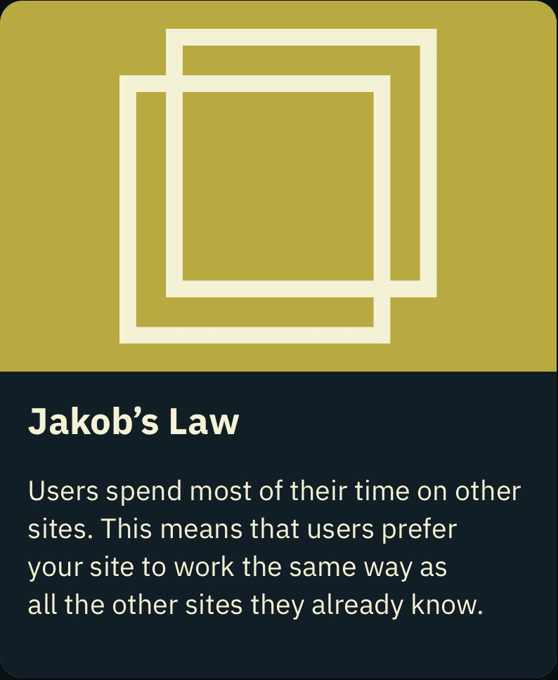


Familiarity Trumps Reinvention
When dealing with finances, users prefer predictable patterns. Elevating the interface required refinement rather than an overhaul of standard mental models.


Back to Top