Reducing Friction in B2B Onboarding:
A UX-First Approach
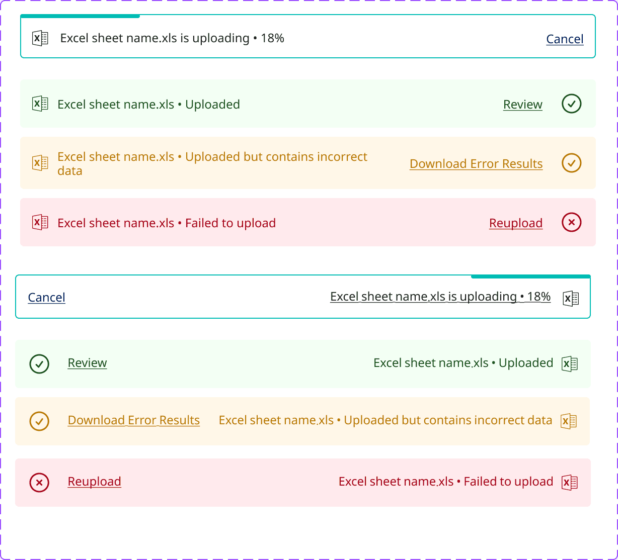
Redesigned the sign-in and sign-up experiences by creating high-fidelity user interfaces and interactive prototypes, ensuring a smoother, more intuitive onboarding flow.
Role
UX Designer
Employer

Platform
Web Responsive
Industry
Financial Services

Results
The new experience encouraged quicker activation and better alignment with business goals. The modular structure also supports future scalability, ensuring a smoother entry point as the platform grows.
Clarified product value early through benefit-driven copy and strategic visuals, helping users understand “what’s in it for me” before committing to sign-up.
Optimized for conversion by applying UX best practices in CTA placement, progressive disclosure, and visual hierarchy to guide users seamlessly through the flow.
Established a scalable onboarding system that can grow with the platform, from adding future roles (like agencies) to integrating smart recommendations and walkthroughs.
Background
This design is part of the onboarding experience for Kashier Payment Solutions. I was handed an outdated, monochrome design and was asked to pair it with the company’s new branding direction.
I created a simple layout with subtle brand identity ensuring accessibility and simplicity.


The original feed, highlighting some of it’s shortfalls.


Designed a simpler, more related screens to the branding and style.
Approach
After establishing a new design system and visual direction, the brand had developed a clearer identity. The next step was to simplify the sign-in experience for new merchants while also showcasing the platform’s services and the value of creating an account.
The solution was a clean sign-in page paired with a carousel highlighting key features and brand collaborations, balancing usability with subtle promotion.


Back to Top