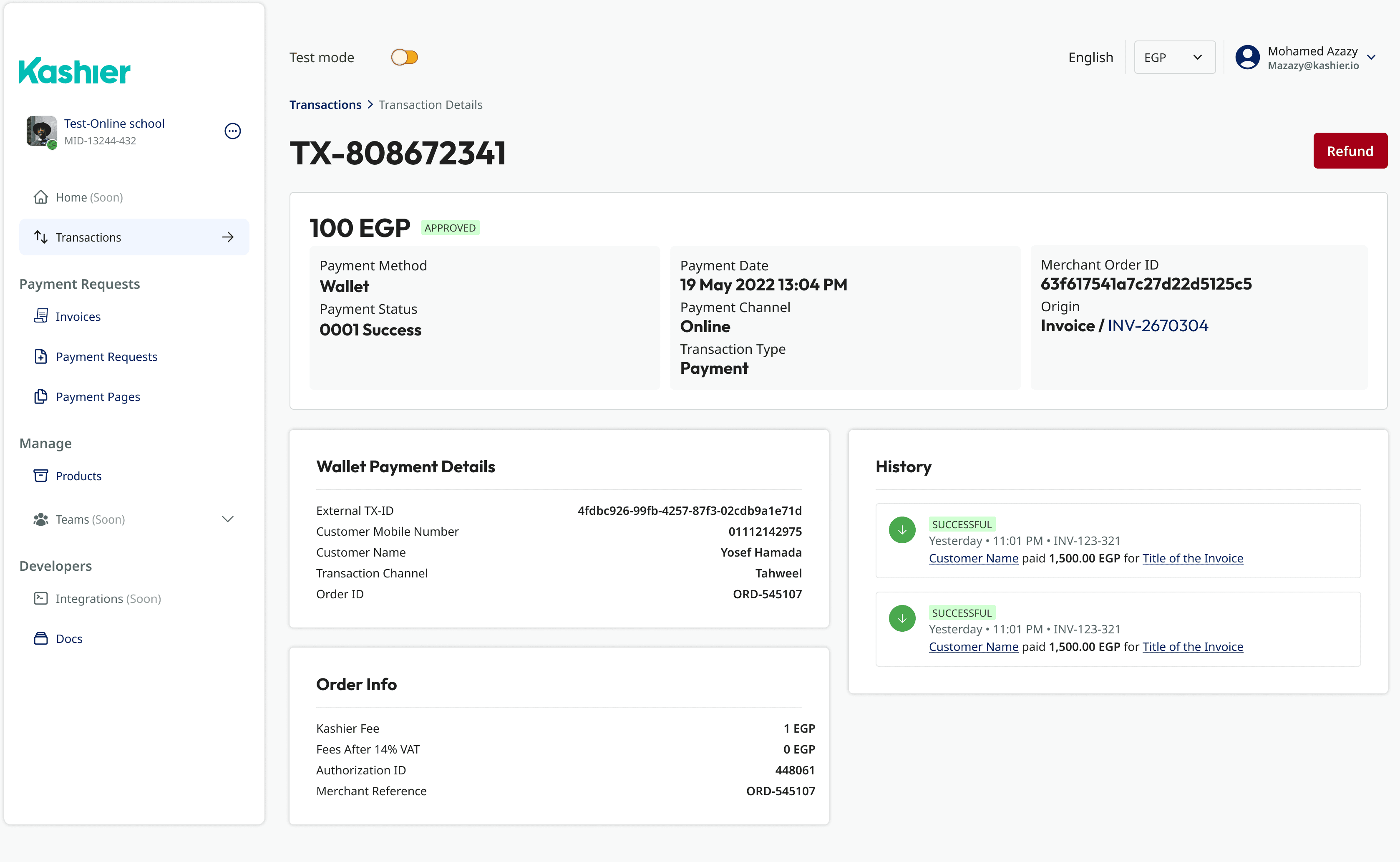
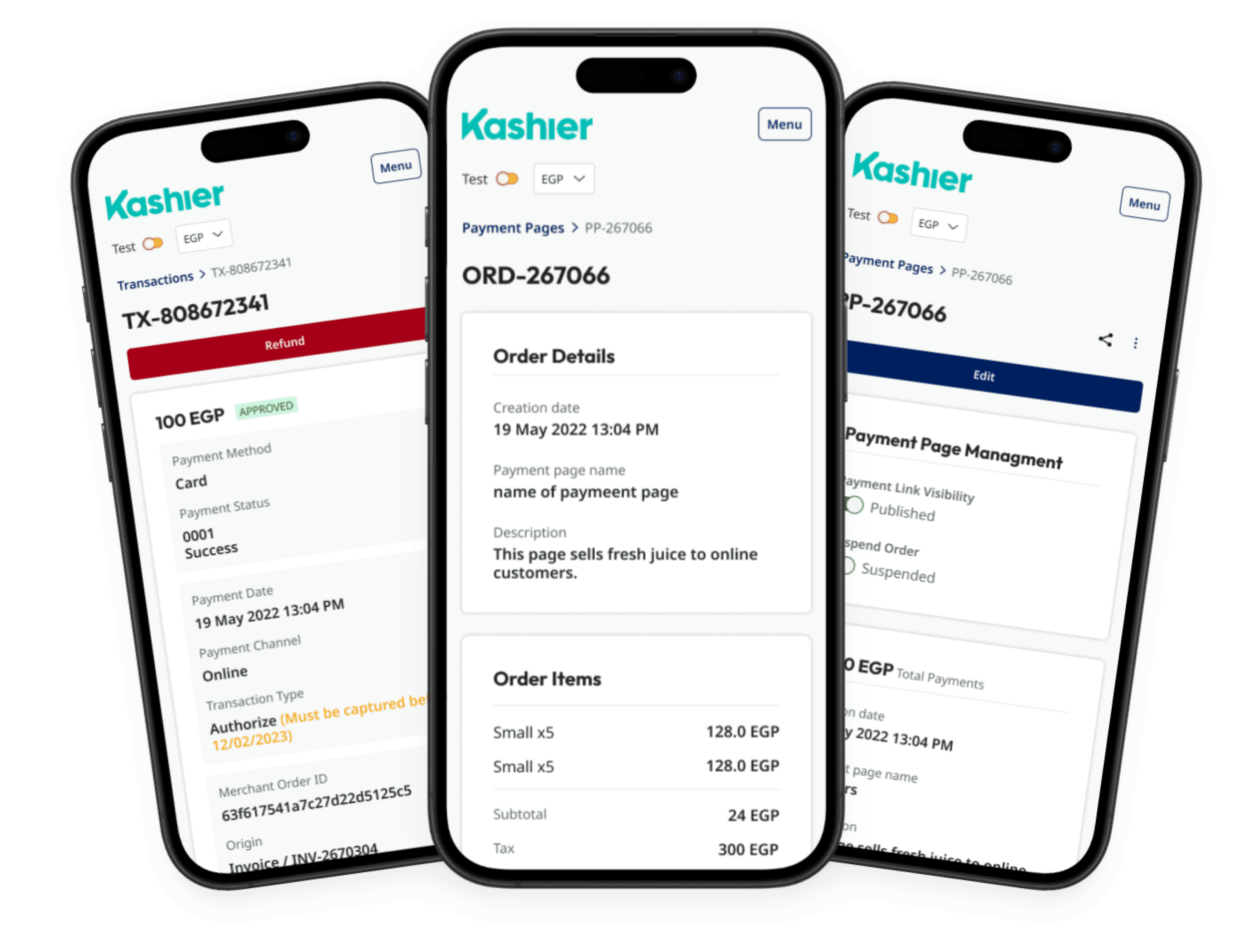
Revamped a fintech dashboard to align with new brand guidelines, streamline key user workflows, and enhance usability, incorporating modern design patterns while addressing user feedback for a more intuitive experience.
Role
UX Designer
Employer

Platform
Web Responsive
Industry
Financial Services


Results
This project didn’t have traditional analytics in place, but I focused on UX improvements with tangible outcomes
Outcome: The dashboard is now in active use and received positive feedback from both the client and their business partners. While we lacked formal UX metrics, the internal team noticed reduced onboarding confusion and smoother workflows.
Ensured clarity in data-heavy environments, maintained a trustworthy visual identity
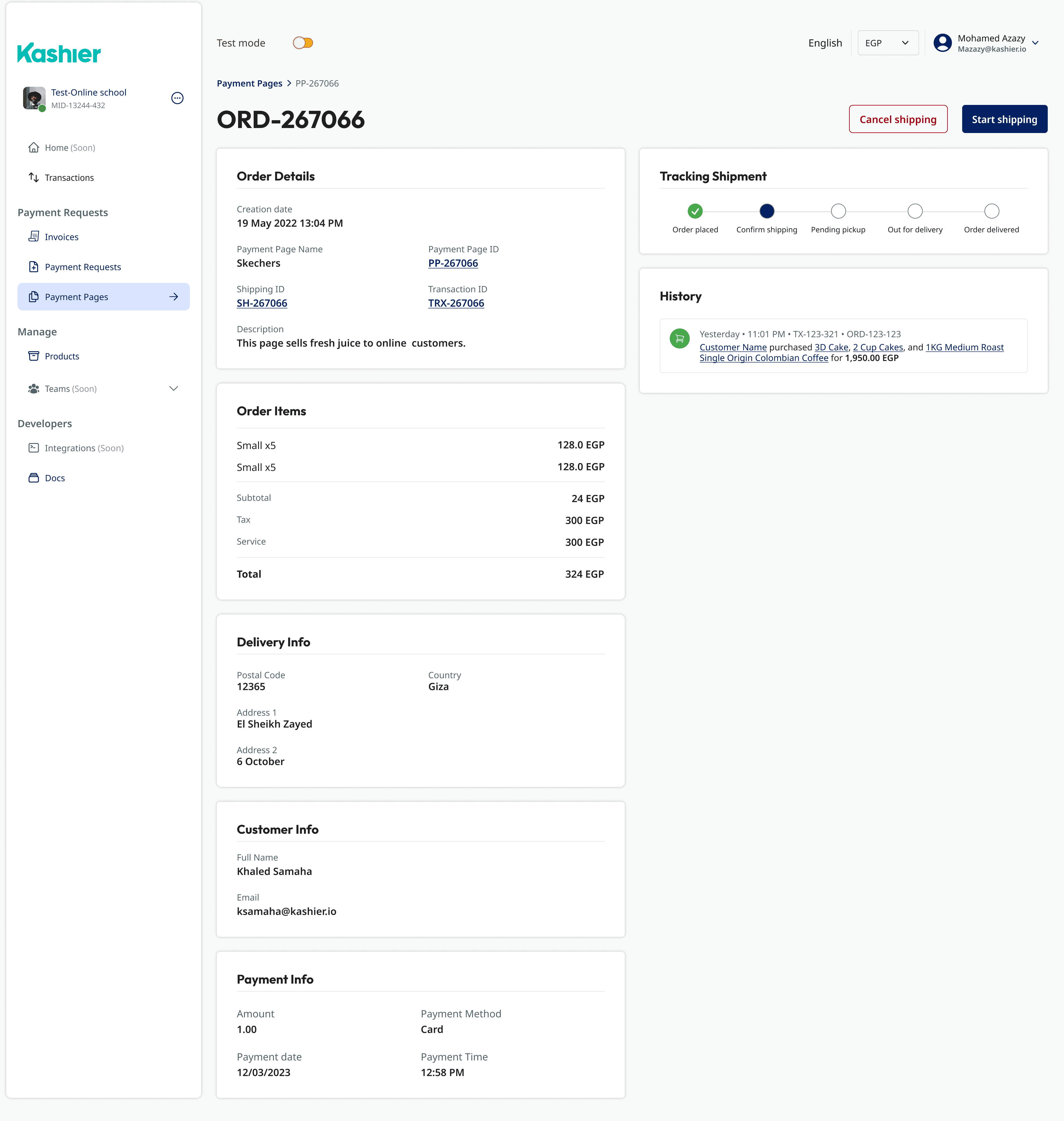
By reducing steps across key dashboard interactions (like setting payouts and managing inventory), merchants could navigate and act faster, with less friction.
Previous feedback highlighted how unintuitive the old flow was. I used that as a foundation to create intuitive patterns, clearer CTAs, and a stronger information hierarchy.
The updated design went through multiple iterations and two client walkthroughs. I aligned closely with the developer (also the client), ensuring the vision was technically feasible and easy to implement.
Background
The existing dashboard had grown cluttered and inconsistent over time, making it difficult for users to complete key tasks efficiently.
As part of a broader design refresh, the objective was to modernize the interface in line with new brand guidelines and improve clarity without overwhelming users.
The challenge was to enhance the visual hierarchy and user flows while keeping the experience familiar to long-time users who relied on the dashboard daily.

The original feed, highlighting some of it’s shortfalls.

Ensured clarity in data-heavy environments, maintained a trustworthy visual identity

The original feed, highlighting some of it’s shortfalls.
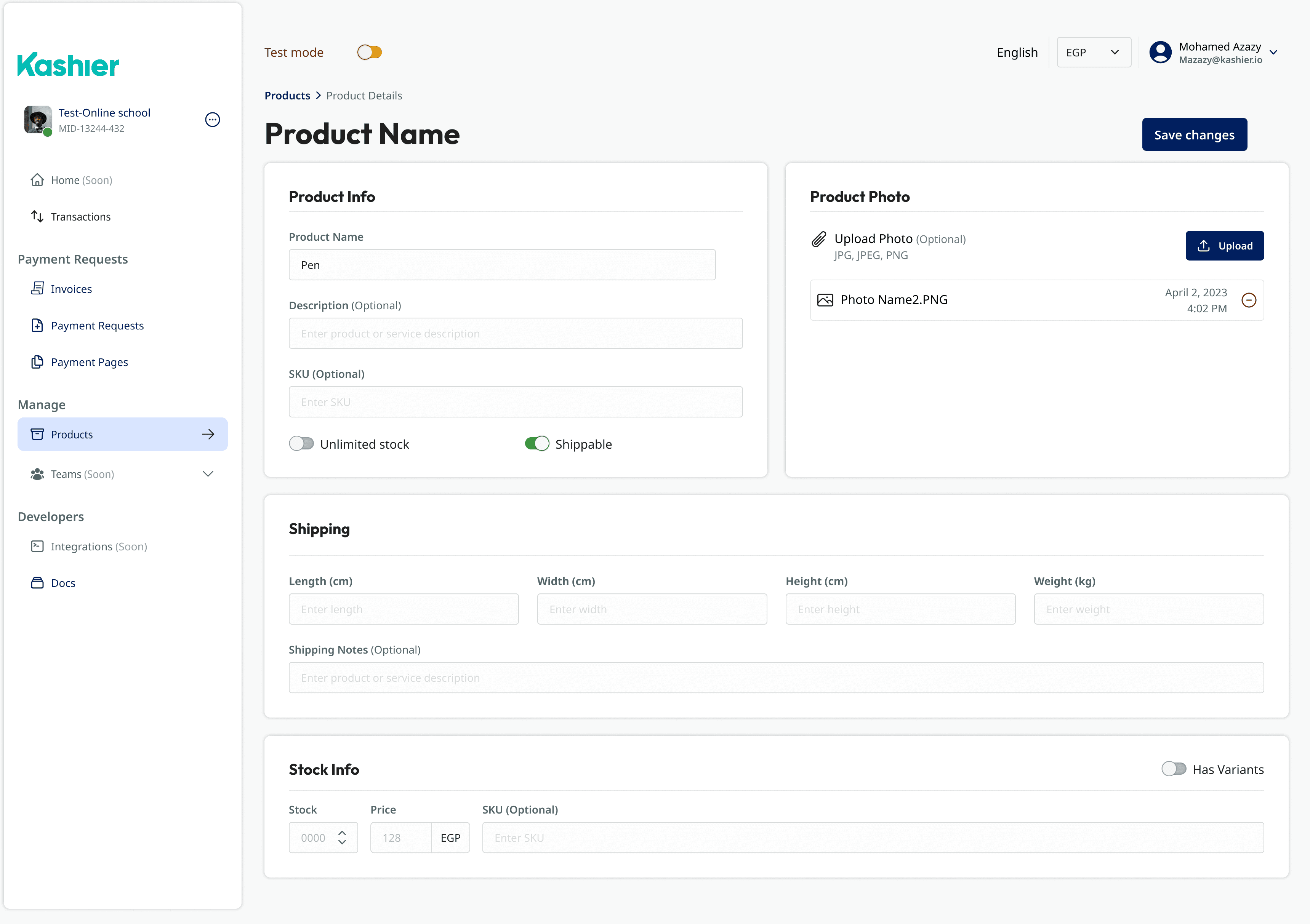
Ensured clarity in data-heavy environments, maintained a trustworthy visual identity

The original feed, highlighting some of it’s shortfalls.

Improved clarity and reduced friction during checkout.
Design System & Branding
I began by researching design patterns and UI trends used by leading financial platforms to better understand user expectations and industry standards.
Based on this, the design team and I developed a focused design system that included scalable components, structured typography, and a finance-friendly color palette for clear data visualization.
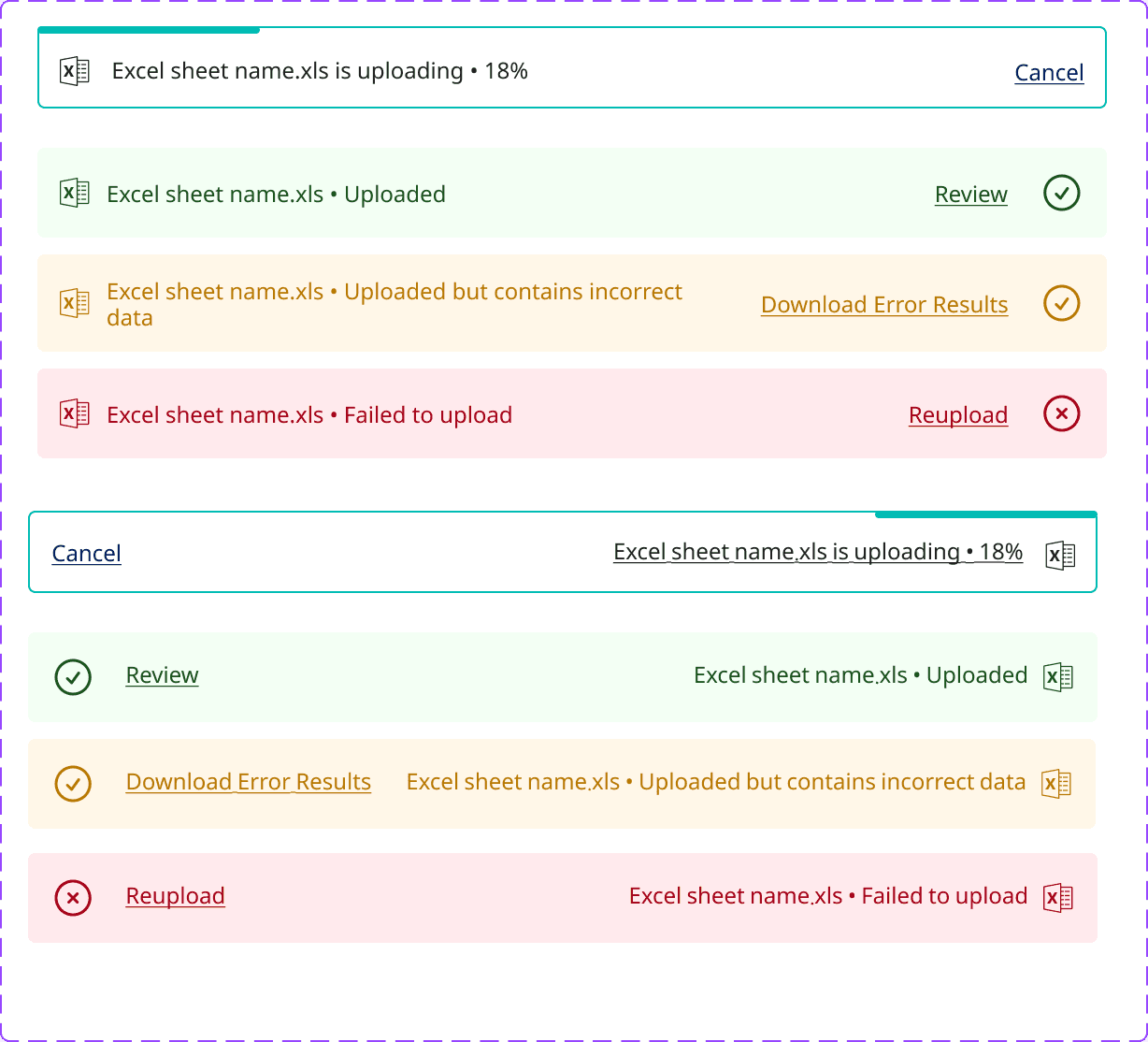
The system was created to ensure clarity in data-heavy environments, maintain a polished and trustworthy visual identity, and streamline the design process by enabling reuse of components across different dashboard views and user roles.

Approach
To address the usability challenges, I began by auditing the current dashboard layout and identifying key areas of friction based on user feedback.
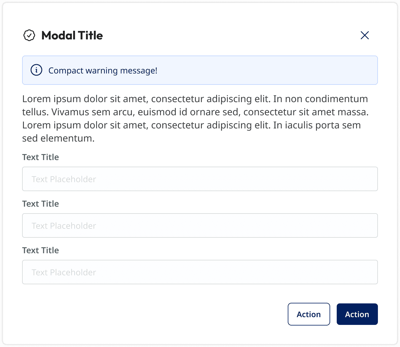
The redesign focused on improving visual clarity through better spacing, consistent components, and refined typography.
Throughout the process, I maintained a familiar structure to reduce the learning curve, ensuring a smoother transition for existing users.

Back to Top


