Capability Catalogue
Redesigned the CIP Catalogue, a centralized repository for projects completed by Eaton teams, to bridge the gap between projects and people. The redesign focuses on accelerating search, streamlining navigation for new joiners, and making organizational knowledge highly visible and accessible across the global enterprise.
Role
UX Designer
Employer

Platform
Web/ Desktop

Background
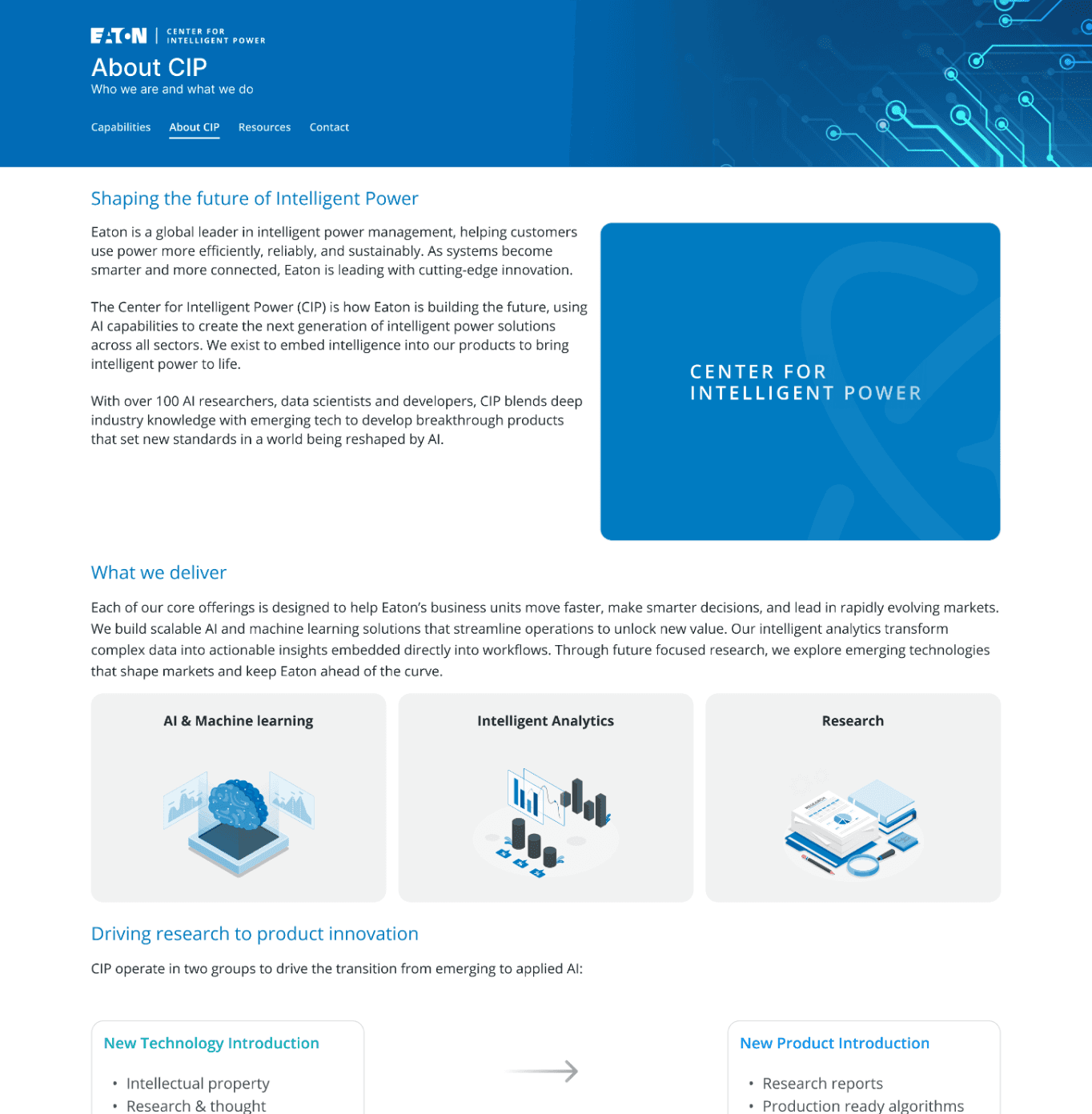
Large enterprise organizations often suffer from internal visibility gaps, where incredible work completed by one team remains completely invisible to another. The CIP Catalogue was created to solve this at Eaton, serving as a centralized hub that documents completed projects and showcases internal capabilities.
Beyond acting as a technical archive, the catalogue serves as a crucial onboarding guide for new joiners and a high-level reference tool for upper management when presenting Eaton’s operational capabilities to external stakeholders.
Problem Space
While the CIP Catalogue holds invaluable institutional knowledge, the existing user experience creates artificial barriers to data retrieval. Because enterprise documentation is inherently complex, users frequently face friction that disrupts their workflow.
Key challenges driving this study include:
Onboarding Friction: New joiners, the most frequent user base, struggle to navigate the ecosystem due to highly dense, jargon-heavy content.
Naming Convention Confusion: High fragmentation in how teams name and classify projects makes browsing highly unpredictable.
Inefficient Access Loops: A high click-depth requirement forces users to jump through multiple navigation layers just to find basic project context.
Research & Discovery
Across the organisation, work was happening everywhere, but often in isolation. Teams operated within their own lanes, with limited visibility into what others were building, researching, or learning.
This resulted in valuable work becoming fragmented, difficult to discover, and at times, going unnoticed altogether. Projects ranged from early‑stage research to fully productionised solutions, yet there was no unified way to surface, connect, or showcase this work.
The goal of this platform was to bring visibility to all projects, regardless of their maturity, and to shift from siloed knowledge to a shared, accessible ecosystem of ideas, and practices. Instead of organising content strictly by team, we aimed to present it as guides, themes, and capabilities that anyone across the organisation could explore and learn from.
“We’re all doing great work, but it’s hard to know what other teams are working on.”
“Some of our most interesting work never gets surfaced outside the team.”
“Everything lives in different places, you have to know where to look.”
“It’s not that the work isn’t documented, it’s just not accessible.”
Key Insights & User Behaviors
Insight 1: Transforming a Static Text Block into a Dynamic Launchpad (Homepage Redesign)


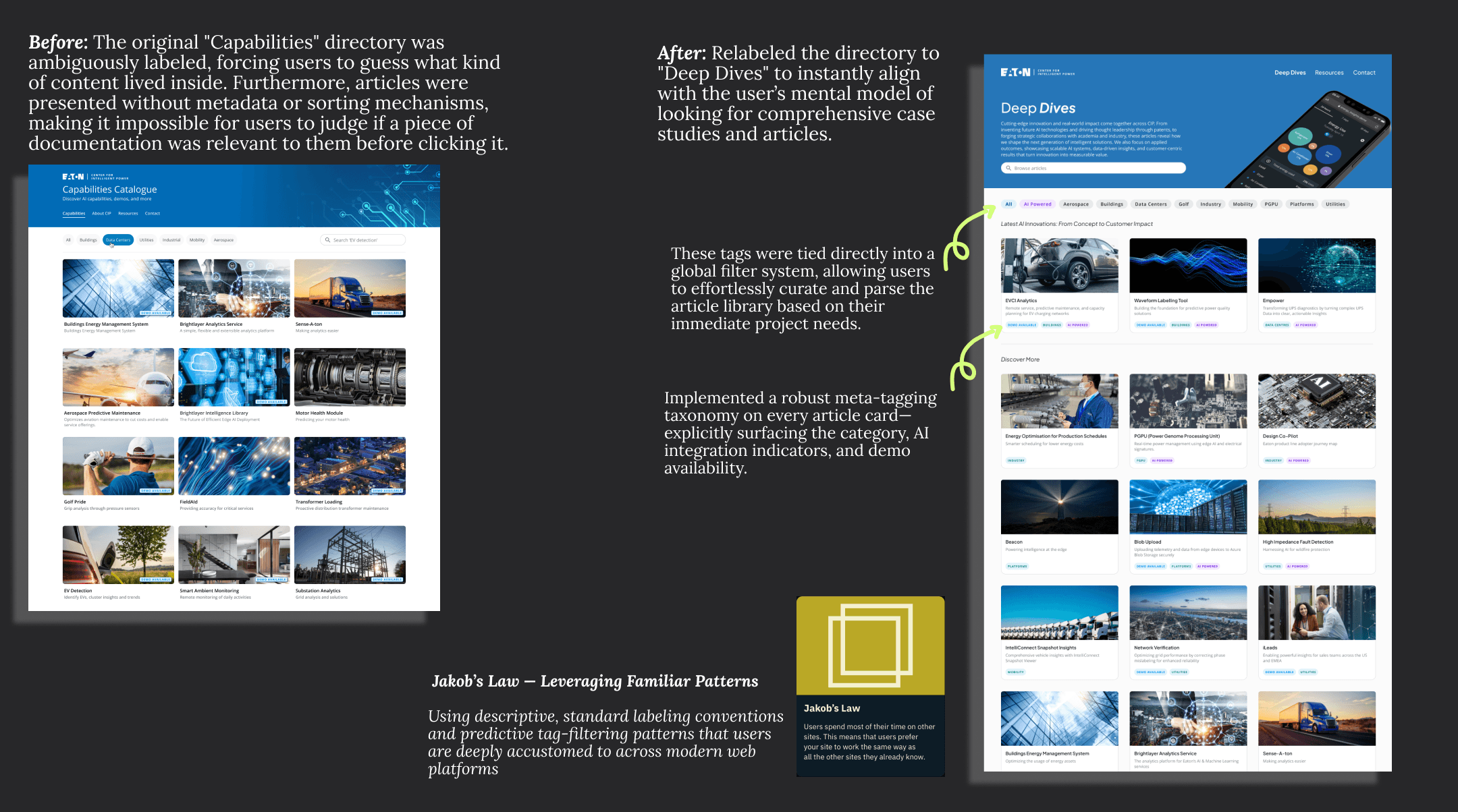
Insight 2: Contextual Clarity & Content Discovery (Deep Dives Directory)


The Collaborative Co-Design Workshop
To move beyond assumptions and design a resource architecture that truly served the enterprise, I facilitated a live, time-boxed co-design workshop with core CIP platform users. The goal was to uncover how different personas naturally categorize information and to discover structural alignment between varying user mental models.
Workshop Logistics & Framework The session was hosted remotely using a hybrid setup to maximize engagement and capture structured feedback efficiently:
The Platform: Conducted visually on Miro with a synchronous group call on Microsoft Teams.
The Structure: Divided into strictly time-boxed phases to maintain focus and prevent fatigue. Each structural iteration was allocated a specific duration, moving the group forward dynamically when the timer went off.
The Finale: The remaining time was reserved for open Q&A, general brainstorming, and cross-functional feedback alignment.
The 4-Board Testing Matrix
Structure #1: Content Type(Format-Based)

This answers: “What kind of resource am I looking for?”
Structure #2: End-to-end- workflow (Lifecycle-based)
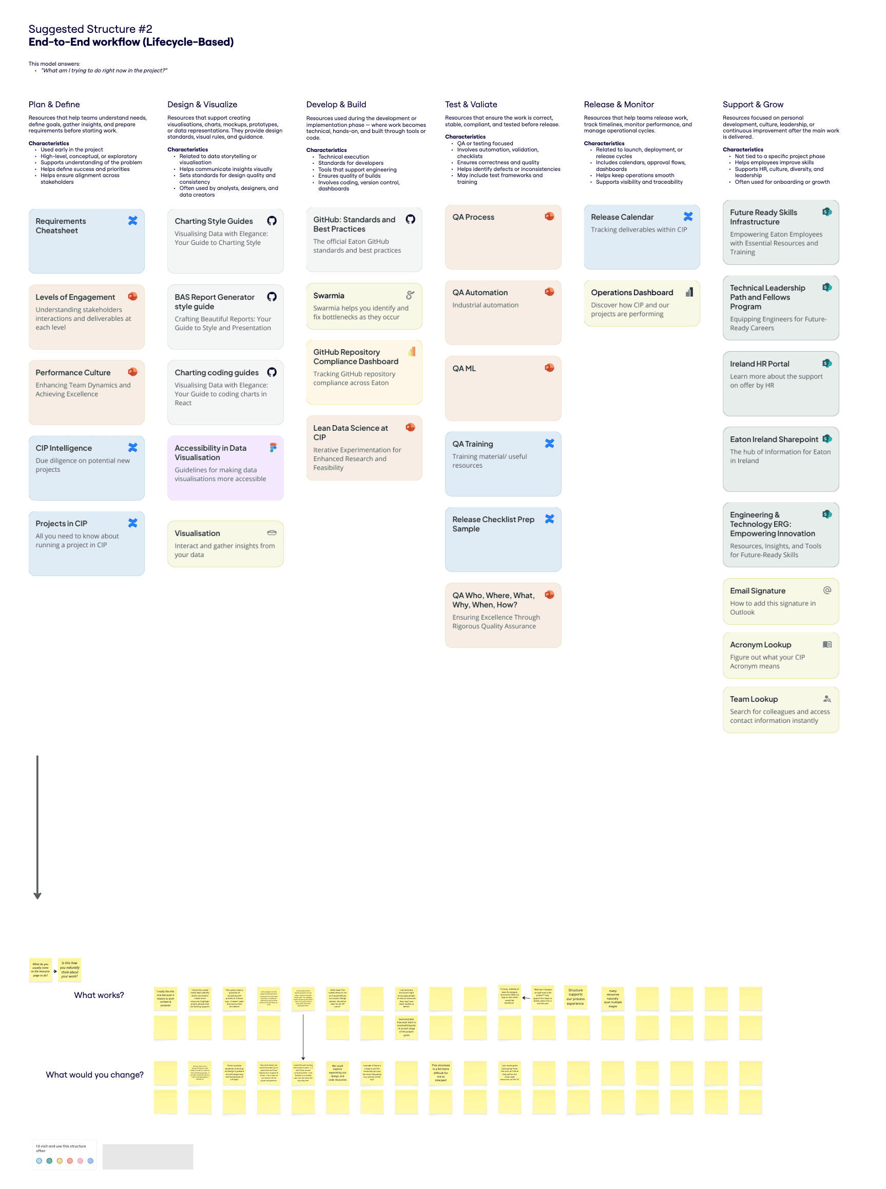
This answers: “What am I trying to do right now in the project?”
Structure #3: Need (Goal -Based)

This answers: “What am I trying to solves right now?”
The Blank Canvas: Free-form sandbox

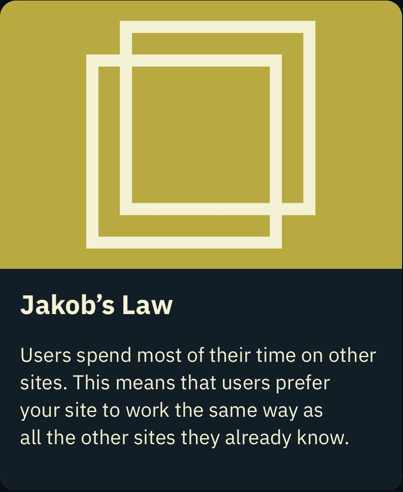
To ensure guidance didn't incentivize bias.
Workshop Synthesis & Key Takeaways
By analyzing the interactive sticky notes, feedback walls, and the custom structures proposed on the blank canvas, I uncovered exactly "where everyone's head was at" across different roles.
To systematically digest the volume of qualitative data, I synthesized the workshop results using Miro Assist, cluster-mapping the sticky notes into clear behavioral themes.
The data highlighted a clear divide in how different groups view and use the platform's resources:

The New Joiner / Occasional User:
Thought exclusively in terms of their immediate goals and workflow actions (e.g., "I just need a guide, I don't care which team wrote it").
“I don’t know the structure well enough to search by team.”
“I just want to get unblocked quickly, without figuring out who owns what.”

The Veteran / Power User:
Naturally thought in terms of internal team boundaries and departmental ownership because they already knew who produced what.
“Most of what I use comes from familiar groups, I don’t often look beyond that.”
“If I don’t know which team owns it, it’s harder to find.”

Voice of the User: Critical Themes
1. The Danger of Team Silos & Corporate Jargon
Users explicitly noted that organizing strictly by internal teams created a heavy mental burden for new users and accidentally siloed information, discouraging cross-team collaboration.
"Maybe tricky for first time users, they must first decide which team might own the thing."
"Grouping by team might discourage people outside of that team using the resources. Might subconsciously think 'it's not for me'."
2. The Power of Goal-Oriented Categories
When presented with structured, workflow-centric labels, users felt an immediate sense of clarity. The categories themselves began acting as a guide, reducing the pressure to guess where files lived.
"I like this approach, reduces decision burden. It's clear the intent for what each category means."
"Coming here to the planning session to see what I need to consider works well—the category itself is teaching me rather than me trying to think what item should be deployed when."
3. Leveraging Search & Immediate Utility
A recurring piece of feedback was that users heavily favor direct execution over deep browsing, validating the decision to bring critical tools to the surface level.
"I typically just search what I am looking for, so maybe having stuff listed in the most used structure would be more helpful."
"I use the search bar more than the filters."


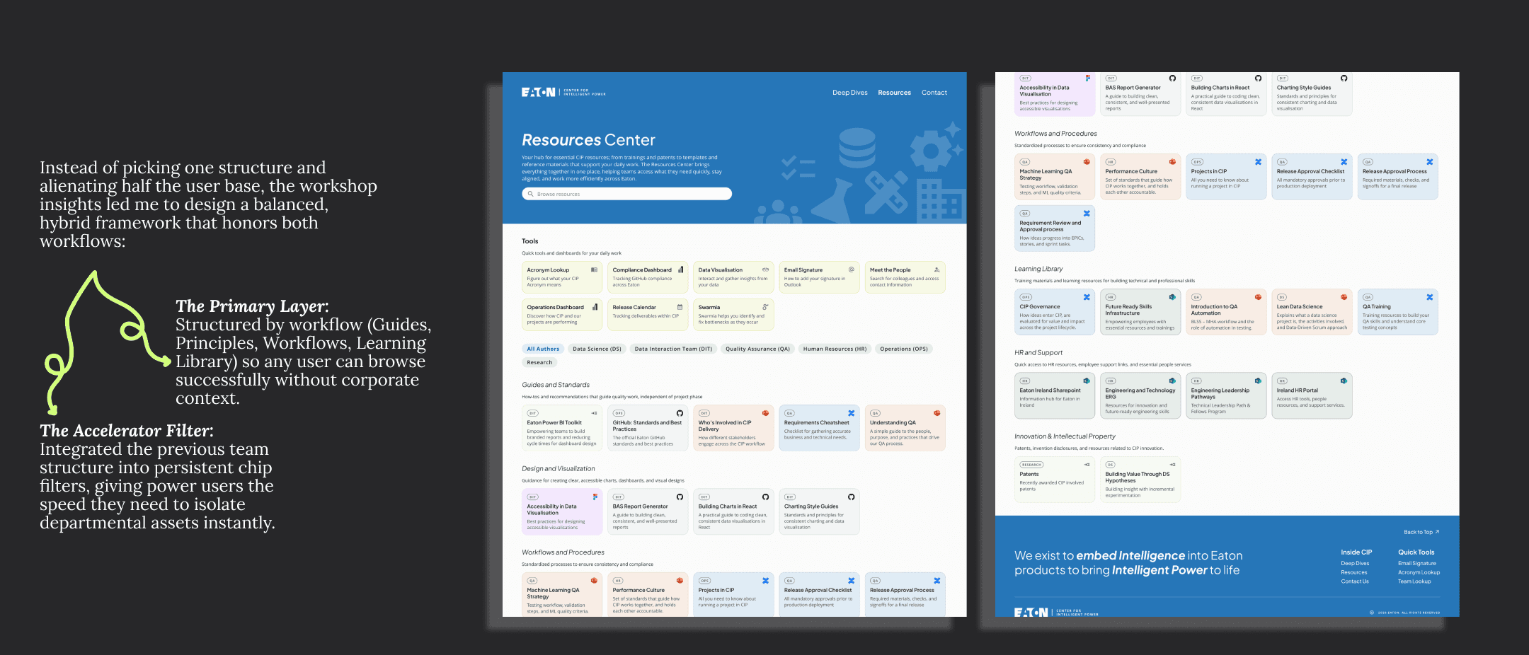
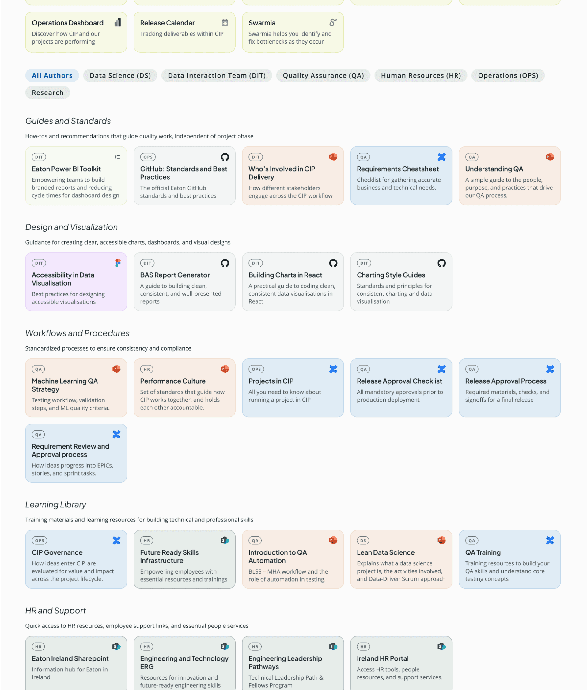
Insight 3: Shifting from Corporate Silos to User Workflows (Resources Restructuring)


Insight 4: Unified Brand Cohesion & Trust (Native Support Framework)


Outcomes
This project taught me how to work end‑to‑end across research, stakeholder collaboration, and iteration, from running interviews and validating ideas with users to aligning with leadership and adapting to technical and delivery constraints. It strengthened my ability to design not just for users, but within real organisational contexts.


Key Takeaways

I learned how valuable it is to engage directly with different user types, from new joiners to experienced team members, and how their perspectives can challenge assumptions. This pushed me to design around real user needs rather than internal structures, balancing feedback from both users and leadership.
I learned how to navigate cross‑team collaboration and organisational complexity, speaking with different teams to understand their work and ensuring it was fairly represented. This helped me grow in facilitating alignment across multiple stakeholders.
Back to Top